Color in the interior
Perhaps it’s no secret that color affects a person’s psycho-emotional state, his thoughts, consciousness, activity and even health. We spend most of our lives indoors, so you should be careful when choosing interior colors. Each room should carry a certain concept, a certain semantic load and create the appropriate mood for those who are in it.
So that it doesn’t turn out that you are relaxed and literally fall asleep in the office, but in the bedroom you feel a surge of activity and even some kind of anxiety - let’s look at each color separately.

Colors are divided into warm and cold. Warm tones tend to stimulate activity and encourage action, while cool tones calm and relax. Warm shades include red, yellow, orange. Cool colors – blue, cyan, violet, green. However, complex colors can change orientation - say, light green will be warmer than pure green, and purple will be cooler than red.
There are also neutral colors - white, black, gray. They are good because they combine harmoniously with almost all other colors. It is also worth considering the area of the room - light colors visually increase the space.
White
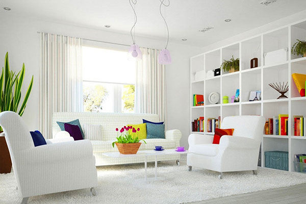
Peace, serenity, purity. White color in the interior is neutral, it charges with energy, expands space, and goes well with bright colors. The downside is that white is the most easily soiled color; too much of it can create a feeling of emptiness and loneliness.
Bright accessories, such as flowerpots with flowering plants, will help make a white interior more fun and varied. White serves as an ideal background for all contrasting flowers, increasing their brightness, so plants with colorful flowers (guzmania, hydrangea) will look very impressive.
Grey
Gray unites white and black, it is the unity of opposites, realism and sanity. And although some people think gray is boring and depressing, many shades of this noble color can make your interior completely special.
Shades of gray look very stylish in interior design - pearl, metallic, ash, silver. In addition, gray, like white, perfectly shades and emphasizes bright details. If you want to focus on the most beautiful interior detail in your opinion, for example, a blooming orchid, gray will be the ideal background.
Black
This color is for non-standard and bold solutions. It should be used in spacious rooms with high ceilings or in small quantities, otherwise it can be overwhelming and create a depressive mood.
Black is especially good for highlighting contrasts and neighboring colors, which look elegant and expressive against a black background. Painting walls black can distract attention from unattractive interior details. By the way, in the East, black symbolizes goodness and perfection, and in Japan it is a symbol of wisdom and nobility.
Green
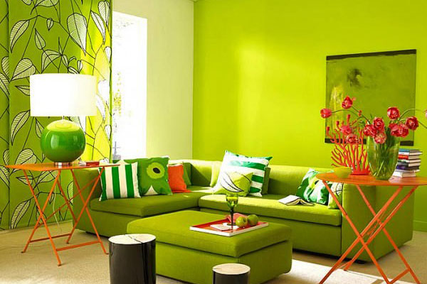
The most cheerful color, the color of foliage, the color of nature, the color of life. It’s not for nothing that we strive to fill our home with indoor plants – they bring revitalization and good energy to the interior. Large plants (bocarnaea, dracaena, monstera) add greenery to the room and give a feeling of living and comfort.
Green color calms and pacifies, while at the same time inspiring and encouraging action. Different shades of green create different atmospheres. Light - joy, new beginnings, creation, change. Dark shades are suitable for conservatives, those who love stability and sustainability in everything. Green color even helps in some cases of depressive disorders and improves the general condition of bronchitis, flu and heart disease. Given such a diverse range of influences of green, it will be appropriate in almost any room.
Red
It is one of the most stimulating flowers, however, in large quantities it can cause anxiety and fatigue. Red can affect blood pressure - the abundance of this color improves blood circulation, releases adrenaline, stimulates sexual desire, gives a person energy and self-confidence.
However, it should be used with extreme caution - too much red can cause aggression and anger. Considering these properties of red, it would be appropriate in the interior of a young couple’s bedroom, office or gym. The color itself is quite aggressive, so you should not use bright accessories.
Yellow
Another color of the warm spectrum is sunny, cheerful, optimistic. Creates a cheerful and warm atmosphere, promotes concentration, encourages new ideas, and increases cognitive interest. A good color for decorating a child's room, but it is important not to overdo it as it can cause excessive activity and sleep problems.
Yellow is used in the interior of an office, living room or kitchen - it promotes communication and creates a light and relaxed atmosphere. In rooms with north and north-west windows, yellow compensates for the lack of daylight. However, you should not get carried away with yellow when decorating rooms for people suffering from insomnia or digestive problems.
Blue
A leisurely color of relaxation and serenity. Relieves stress, eliminates fussiness, creates an atmosphere of cool tranquility. An excellent housing solution for a person who wants to relax at home from the bustle of the city. Different shades of blue are also used in the design of a nursery or bathroom.
Blue and cyan colors are often used in the design of medical institutions; they promote relaxation and help with insomnia. It is worth considering that an excess of blue, on the contrary, can cause depression and apathy. A room with dominant blue will be decorated and enlivened by plants with flowers in contrasting warm shades - for example, pink Saintpaulia or azalea.
We looked at the primary colors, the rest - orange, pink, blue, brown and others are secondary shades. Of course, the design of a room or office is always multi-colored. Each of us has our own taste preferences and wishes. We hope that this article will help you choose the most successful combinations according to the intended purpose of the room, your taste and character.
Let your home be cozy!


 2-4 trunks")
